



 You are here:
Thread Colour Matching: How Pantone References Become Embroidery Thread
 Release time:2026-11-14
 Views:
Written by Liu Ronghui | Dongguan Dobest Industrial Co., Ltd., Founder & Technical Director Last updated: 2026-11-14
A buyer sends a Pantone number. The factory sends back a photo of a patch. The buyer says "that's not the right blue." Three weeks later, nobody can prove who was wrong, because nobody agreed on how the colour would be judged.
Colour is the single most common source of dispute in custom embroidery — and almost always for a reason that has nothing to do with the factory's skill: a Pantone number describes ink on paper, while embroidery is dyed yarn under light.
This guide explains what can and cannot be matched, how the process actually runs, and how to specify colour so the sample you approve is the sample you receive.
1. The short answer
- Pantone is a starting reference, not a specification. We convert it to the nearest thread in a physical thread library, then confirm on a stitched sample.
- Exact match is not achievable across materials. Ink on coated paper and dyed polyester thread will never be numerically identical.
- What is achievable: a close visual match under defined lighting, confirmed by a physical sample you approve.
- What decides success: thread range, surface (pile vs flat), lighting, and how you judge the sample.
2. Why thread and Pantone diverge
| Factor | Pantone (ink on paper) | Embroidery thread (dyed yarn) |
|---|---|---|
| Substrate | Coated paper | Twisted synthetic or natural fibre |
| Light behaviour | Flat, mostly diffuse | Directional, affected by twist and sheen |
| Surface | Smooth | Flat satin, loop pile, or sheared pile |
| Reproduction | Printed to a formula | Dyed in batches with tolerances |
| Perception | Seen as a flat chip | Seen as texture under a garment's lighting |
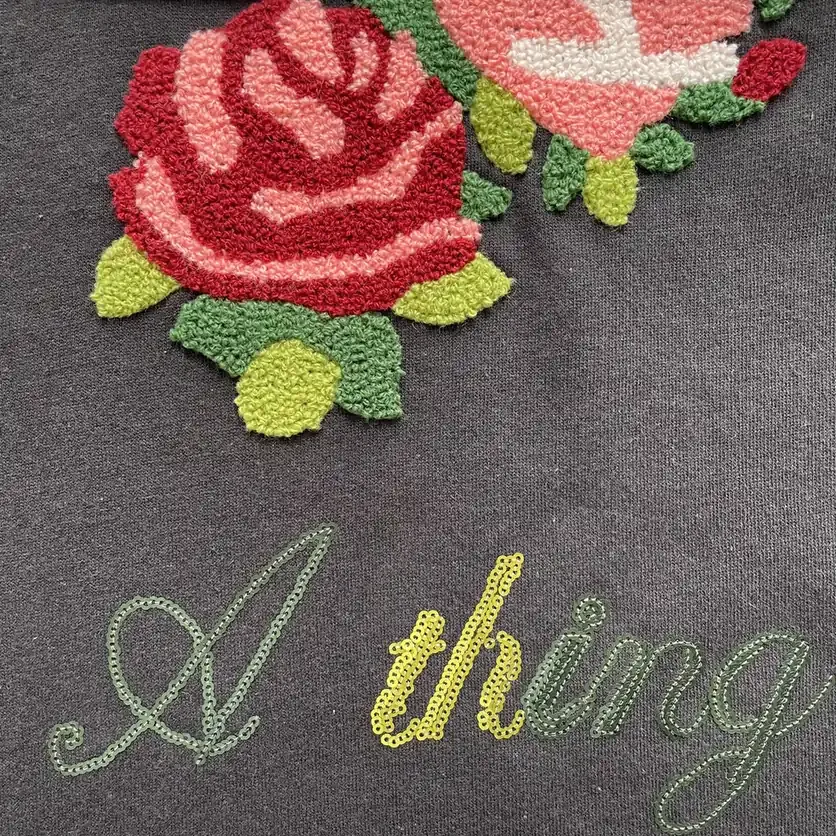
Add the third variable — the surface the thread sits on — and the same thread can read lighter on flat satin and darker inside a deep pile, because pile traps shadow.
3. How the matching process actually runs
Step 1 — Convert the reference to thread candidates
We take your Pantone code and pull the nearest candidates from the thread library we run (typically two or three options, not one). Different libraries have different gaps; a colour that is easy in one brand may sit between shades in another.
Step 2 — Stitch a physical sample
Candidates are stitched on the actual base fabric, in the actual craft — flat, chenille or toothbrush pile. This matters: a 3 mm pile and a flat satin field will not read the same even with identical thread.
Step 3 — Judge under one light source
Colour is only meaningful under a defined illuminant. We photograph and assess under D65 (approximately daylight, 6500K) and note the light source on the approval sheet. If you judge under warm office lighting, you will reject samples that are correct.
Step 4 — Approve against a physical reference
You approve the physical sample, not a screen image. Phone cameras shift colour, and every screen is calibrated differently.
4. What is realistically achievable
| Colour type | Matchability | Notes |
|---|---|---|
| Standard solid colours | High | Large thread libraries cover most Pantone ranges |
| Deep saturated blues and reds | Medium | Dye batches vary; approve a physical standard and keep it on file |
| Pastels and very light tints | Medium | Small differences are more visible; surface texture dominates |
| Metallics and golds | Low–medium | Metallic yarns shift strongly with angle and lighting |
| Fluorescents and neons | Low | Thread range is limited; expect a compromise |
| Glow-in-the-dark | Low | Base colour is constrained by the phosphorescent compound |
| Gradient / ombré | Medium | Achieved by blending threads; the transition is a design decision, not a colour match |
Rule of thumb: the more the colour depends on reflection (metallic, pearl, neon), the less a Pantone number can control it.
5. Colour consistency across a bulk order
Even with an approved sample, bulk can drift. What controls it:
1. One dye lot per order. We reserve thread from a single lot for the run; splitting lots is where visible banding starts. 2. A retained standard. The approved sample is kept and referenced during production, not just at the start. 3. In-process checks. Colour is checked against the retained standard at the start, middle and end of the run — not only on the first piece. 4. Documented light source. Checks happen under the same D65 condition as approval.
6. How to specify colour so it survives production
Best — send all three:
1. The Pantone code (e.g. Pantone 19-4052 TCX), noted as TCX (textile) rather than C (coated) if you have it; 2. A physical swatch of the target material if the patch must match an existing garment; 3. The craft and surface — flat, chenille, or toothbrush pile — because that changes how the colour reads.
Also tell us:
- The light the product will be judged under (retail, daylight, stage);
- Whether the patch must match a garment panel exactly, or only look correct on its own;
- Any colour that is a brand standard with a tolerance requirement.
Worst — and very common: a screenshot of a Pantone chip from a phone. The screen has already changed the colour before we see it.
7. Colour fastness — the part buyers forget
Matching at sampling is only half the job. The other half is keeping that colour after washing and light exposure.
- Washing: standard polyester thread holds colour well; deep saturated shades should be tested on the actual care programme.
- Light: shop-window and outdoor exposure fade reds and some blues first. If the product lives in a window, say so — we can specify a more light-fast thread.
- Abrasion: pile surfaces lose colour intensity as fibres mat, even without dye loss.
Ask for a wash-tested sample when colour is critical; a display sample proves nothing about durability.
8. FAQ
Can you match RAL or NCS instead of Pantone? Yes — the process is the same: convert to thread candidates, then confirm on a stitched sample.
Will you guarantee an exact Pantone match? No, and no embroidery supplier honestly can. What we commit to is a documented match under a stated light source, confirmed by a physical sample.
How long does colour matching add to sampling? Usually nothing — matching happens within the standard 24–48 hour sampling window for standard crafts. Unusual colours, metallics, or multi-colour blends can add 1–2 days.
Can you match to a photo? We can get close, but a photo is a poor reference. Send a physical swatch if accuracy matters.
What if bulk arrives slightly different from the approved sample? Send photographs under D65 plus the sample reference. If it is outside the approved standard, that is a production issue and we address it; if it is a lighting difference, the retained standard settles it quickly.
9. How we handle colour in a project
1. You send Pantone code + physical swatch + intended craft; 2. We return two or three thread candidates stitched on your fabric; 3. You approve one under a stated light source; 4. We retain the approved standard and check bulk against it.
Sampling runs 24–48 hours for standard crafts; bulk 5–10 working days after approval. MOQ is 300 pieces, with smaller runs reviewed case by case.
Next step: send the Pantone code, a physical swatch and the intended craft, and we will return two or three stitched candidates on your fabric. Request a colour match — standard sampling is 24–48 hours. If the patch has to survive frequent washing, read the wash and durability guide before you approve the colour.

 2/F, Bldg E, Jinmao Xincheng, No.7 Jiedong South Rd, Xiaojiejiao, Humen, Dongguan, Guangdong, China
 mclau@dobest.hk